|
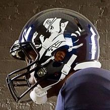
We've entered an era where the basic home and road jerseys don't cut it anymore for most major college football programs. Nebraska and Wisconsin unveiled their third jerseys a few weeks ago, and Virginia Tech has some interesting uniforms to kick off the season. For Notre Dame and Adidas, the Irish had a new uniform for their matchup against Michigan last season. For 2012, the Irish continue their "Shamrock Series" makeover with another new look for their matchup at Soldier Field against Miami (FL) on October 6th. As a Notre Dame fan, I have my thoughts on the 2012 uniforms like anyone else. Here's what I think of them. Let's start with the most precious part of the Notre Dame uniform, and that would be the helmet. I am someone who believes the helmet should stay plain and painted in that 18-carat gold. Adidas did three things I don't like. First off is the double colors. A general rule for me is that all helmets should have one base color. The darker navy blue with the fighting Irish logo is different. Then again, I'm not too big on it. The shamrock on their helmets last season was enough for me. This doesn't scream "Notre Dame." Other schools like Maryland and Oregon can pull this off, but the Irish can't. Not a fan of the "bedazzled" gold on the helmet either. HELMET GRADE: C- Now, let's move on to the rest. The navy blue is darker, which is OK. Then again, navy blue, darker or lighter, can be hard to recognize. The number font is not a problem. Notre Dame has had uniforms in the past with almost the same style font. The gold is about the same, although it looks brighter in the Adidas photos. Good move on keeping the gold pants with the addition of a navy blue stripes on the side with the fighting Irish logo. It could've been worse, the jersey could be green. UNIFORM GRADE: B
FINAL THOUGHTS To wrap this up, I'll give you some final thoughts on the jerseys. They aren't terrible, but they might make some Notre Dame fans value the green jerseys a little more than they have in the past. We have to deal with the fact that the longer the Irish do this "Shamrock Series," it is an opportunity for Adidas to create a new look for the Irish in one of their 12 regular season games. The leprechaun logo, which is rarely used compared to the "ND" insignia, makes more than one appearance in the new uniforms, especially invading the oddly painted helmet. If Adidas left the helmet alone this time around, my views on the whole uniform would be different. But I have to go with the Penn State mindset when it comes to uniforms. Keep it simple. Regardless, Adidas will see many buying these, especially if they only stay for one year. But nothing beats the regular home jersey (pictured below).
0 Comments
Leave a Reply. |
Archives
September 2018
|


 RSS Feed
